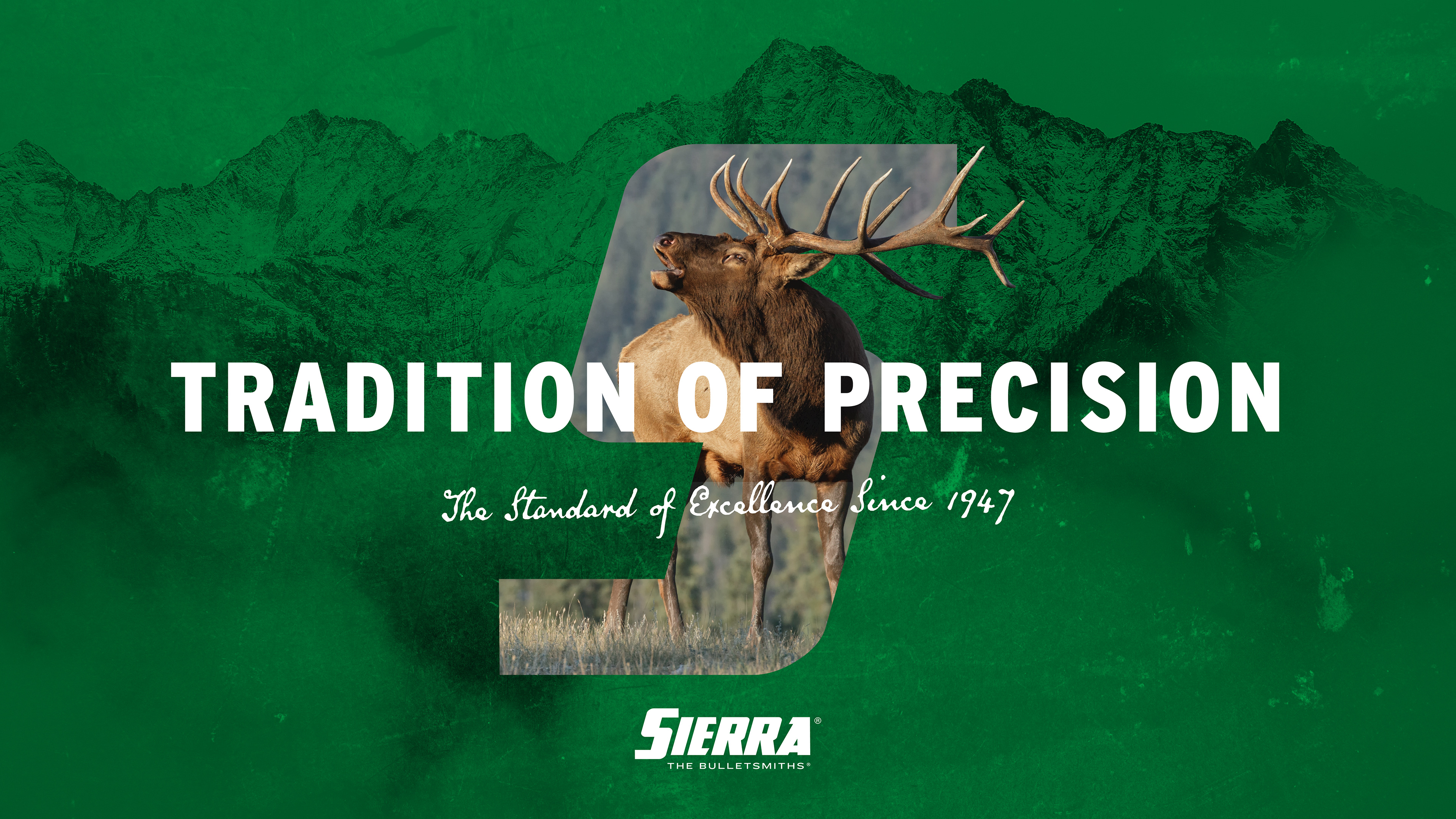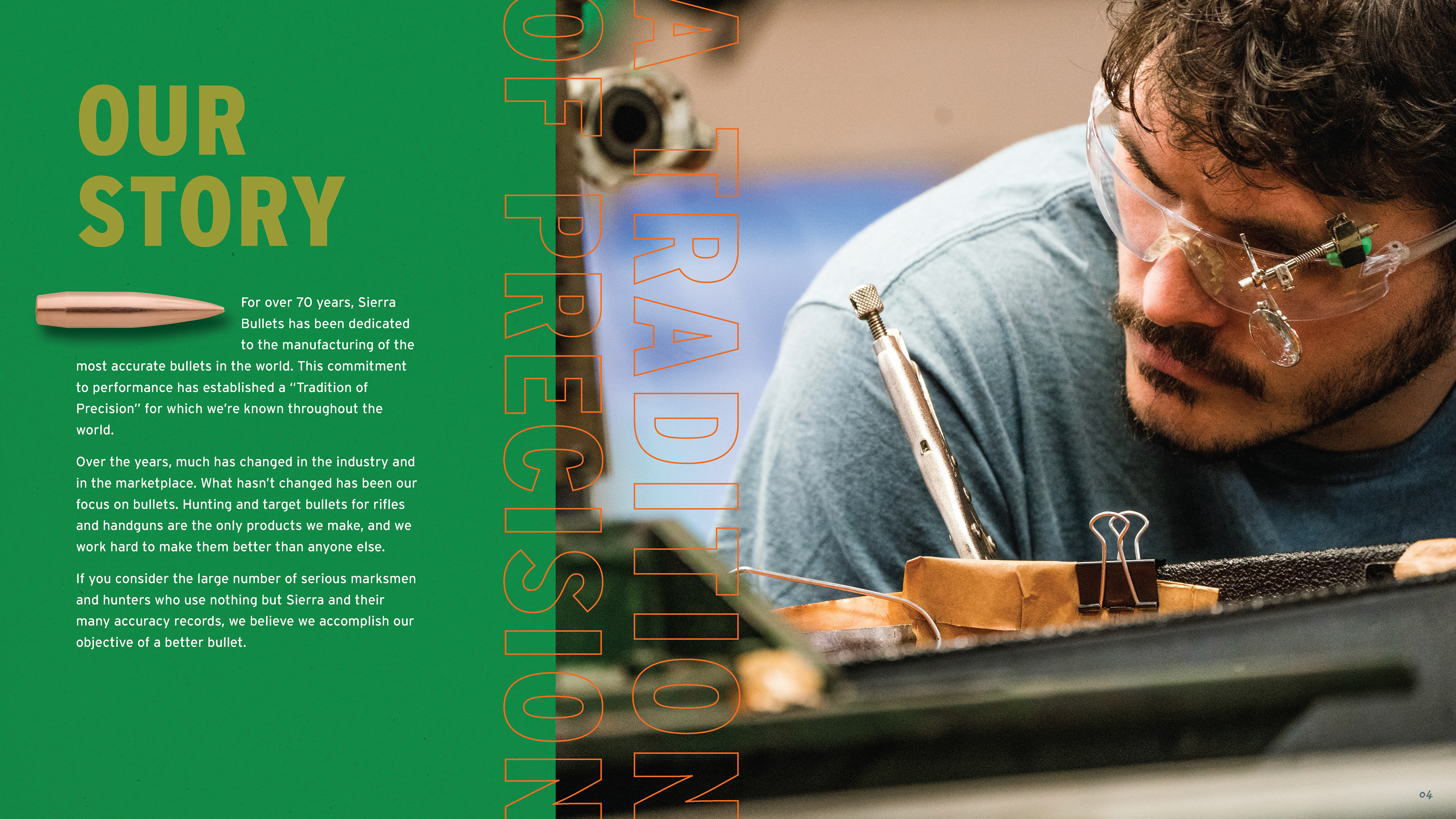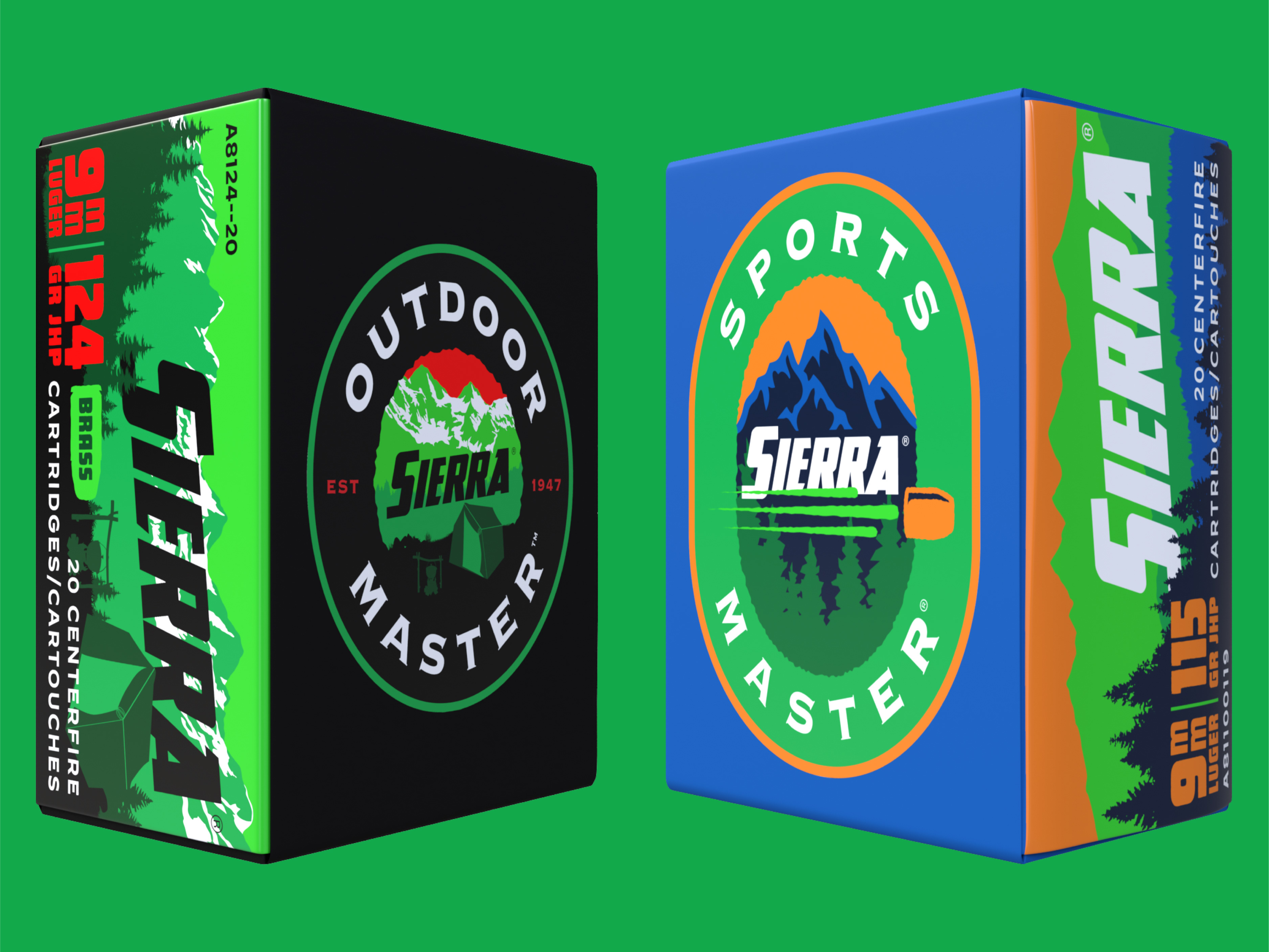
Sierra Bullets had the heritage. What it lacked was a visual system that communicated it. The existing packaging wasn't doing justice to a brand with over 70 years of precision manufacturing behind it — and convincing the client of that took time.
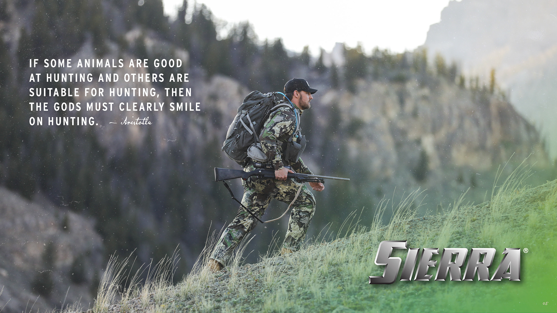
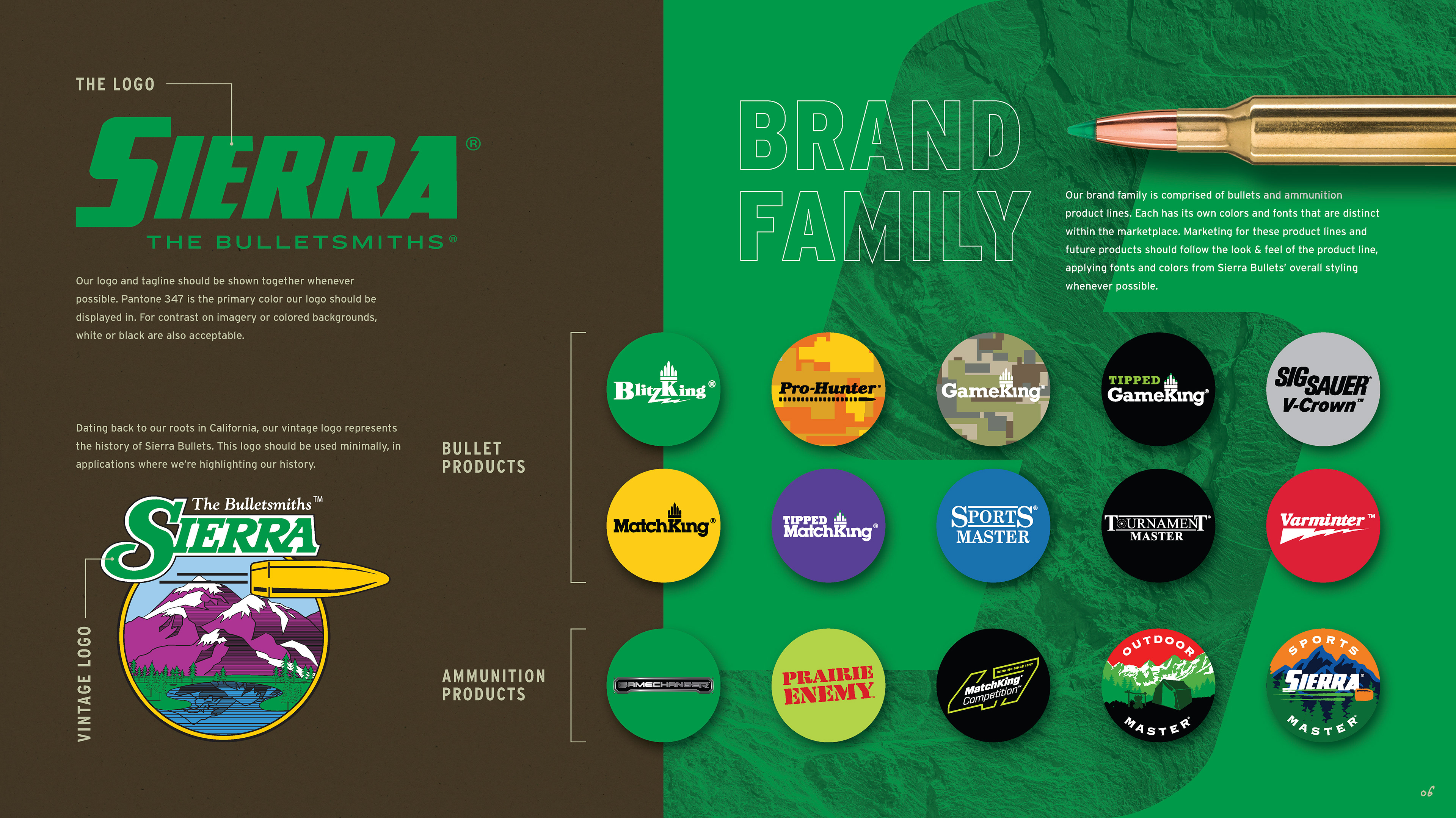
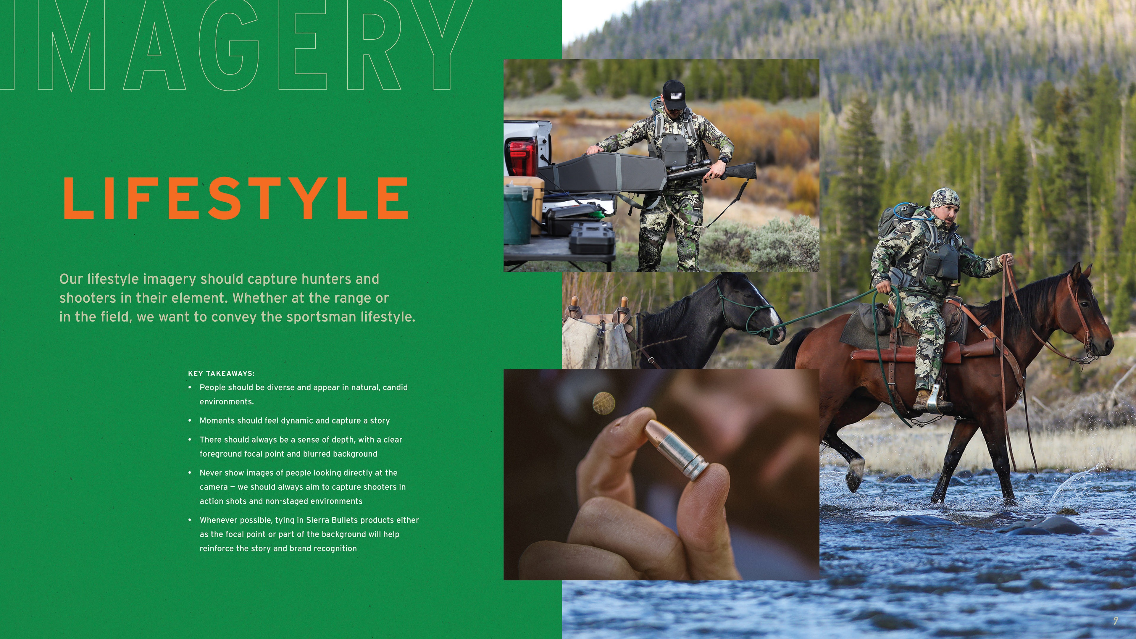
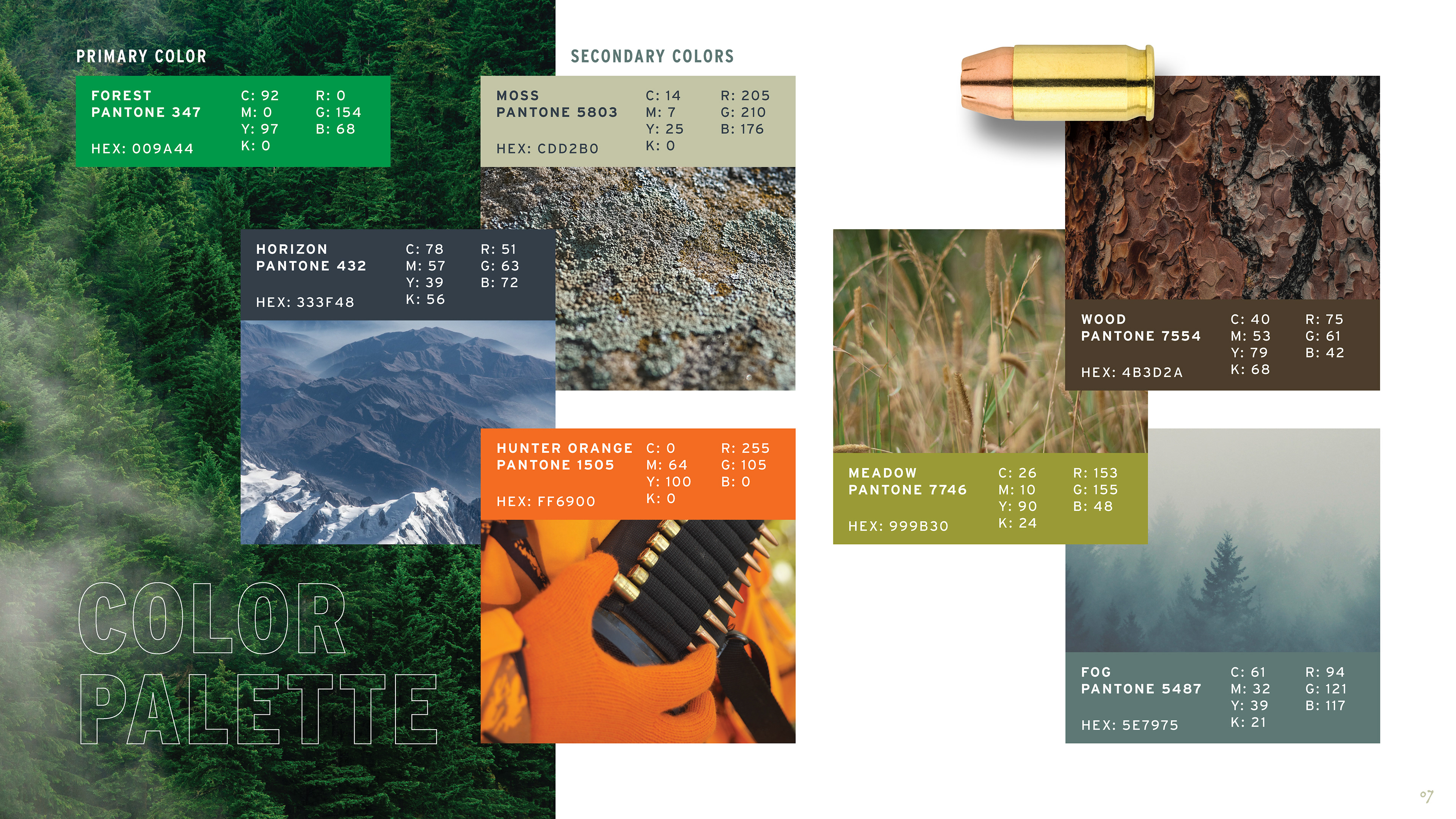
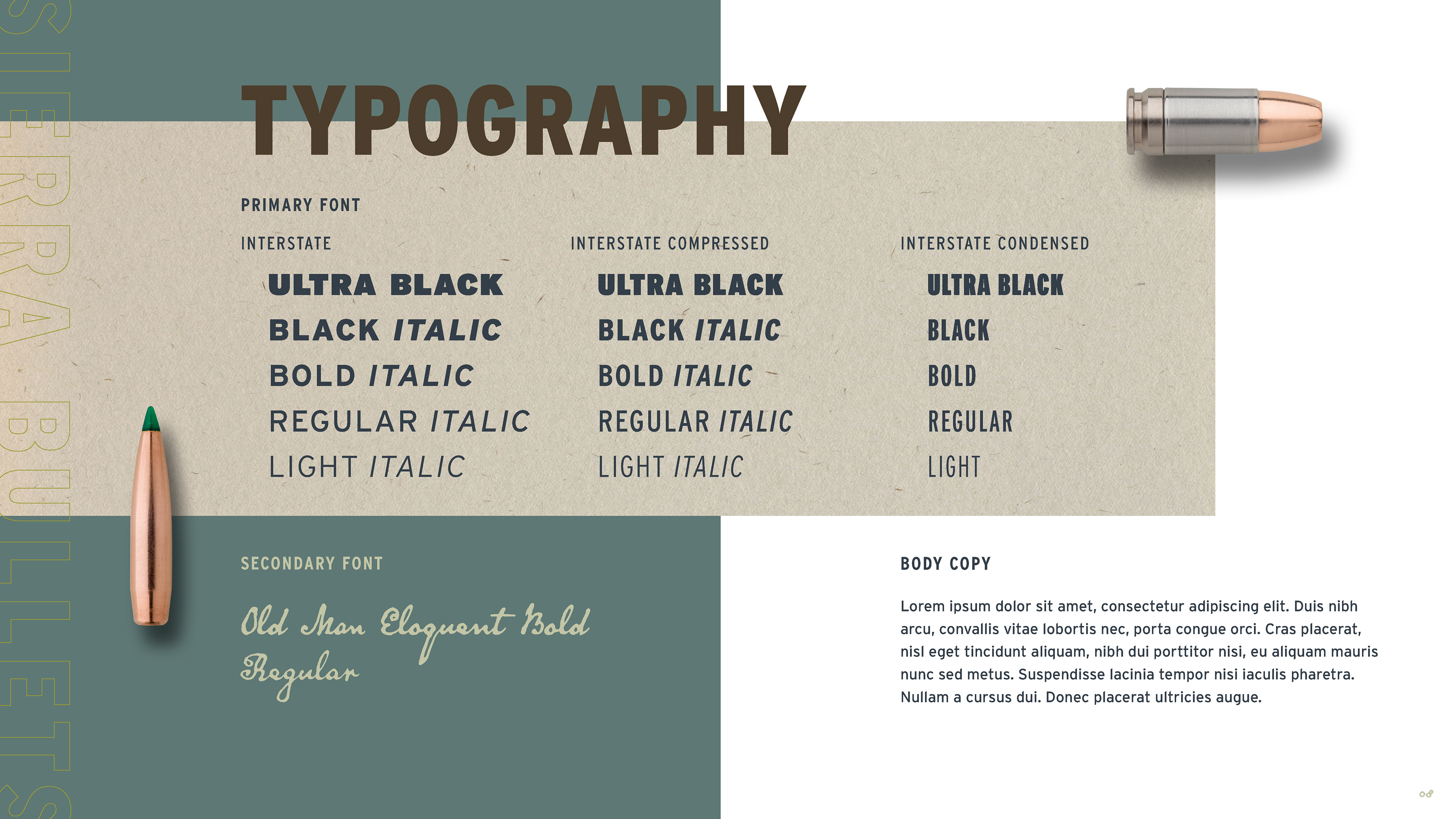
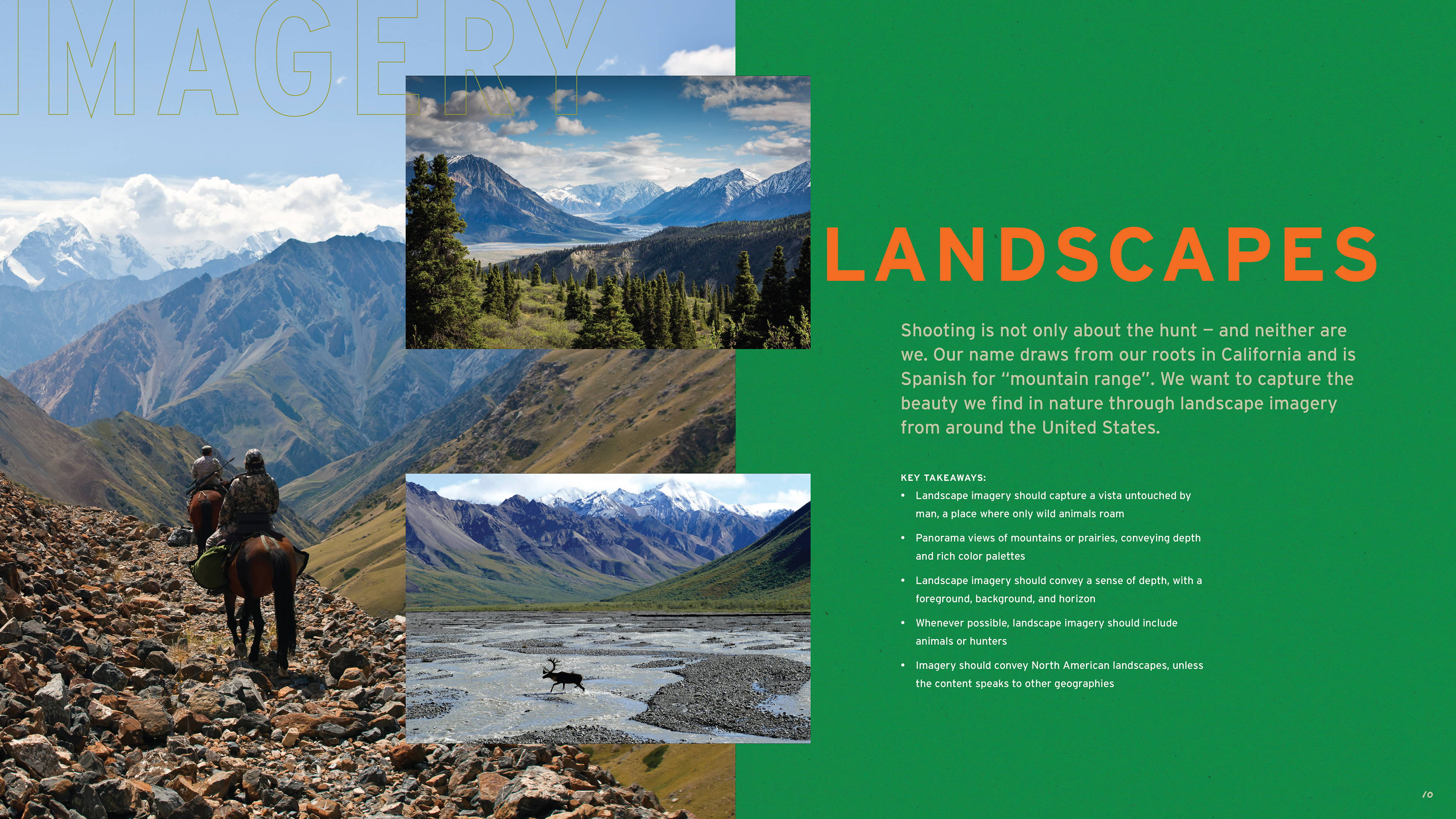
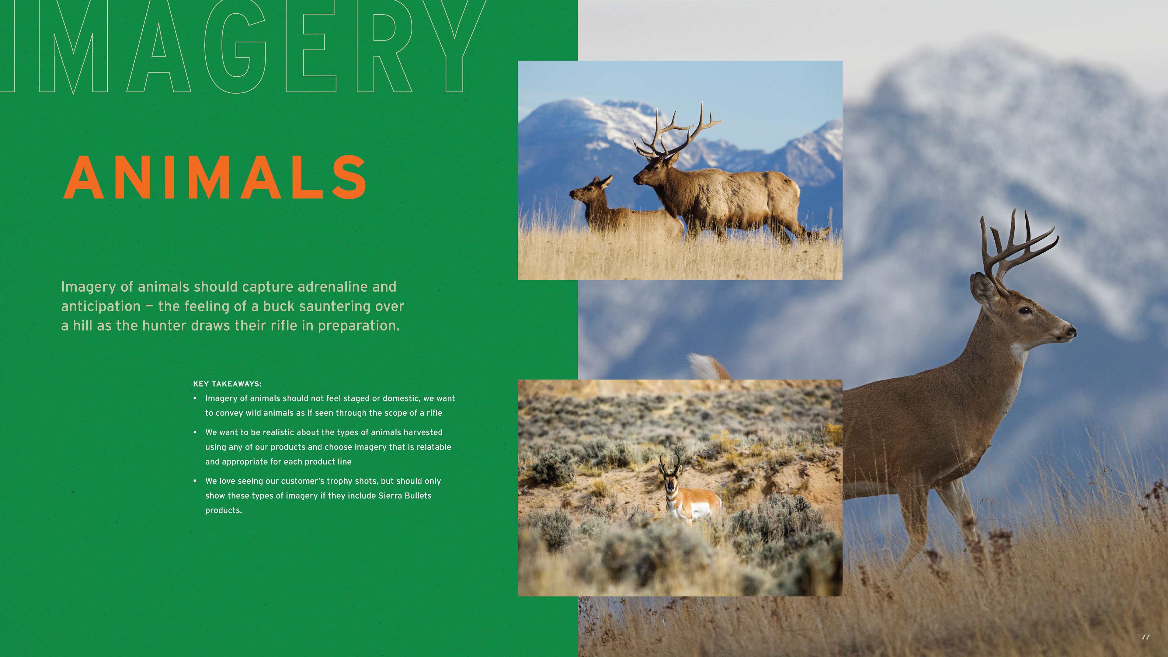
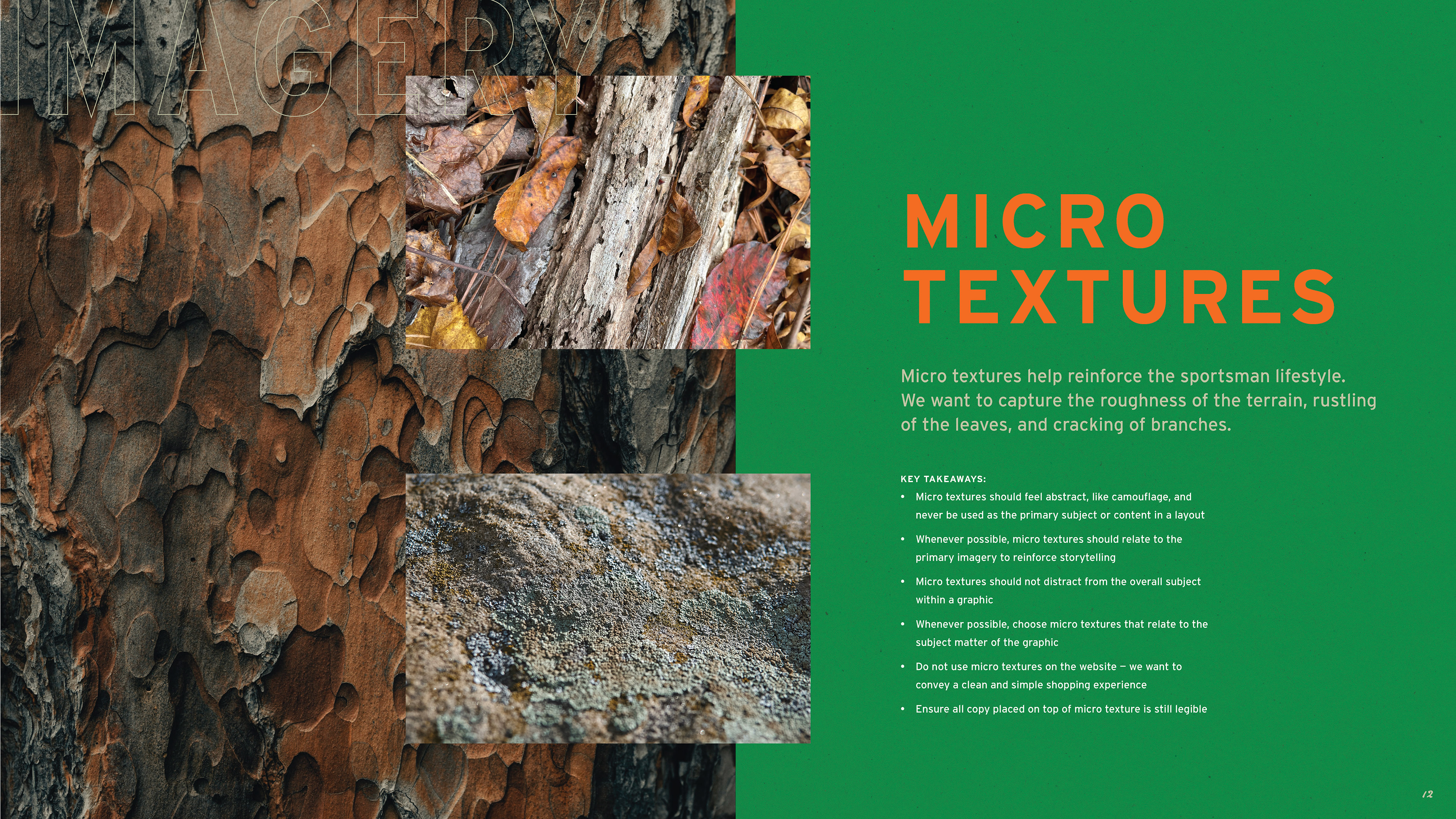
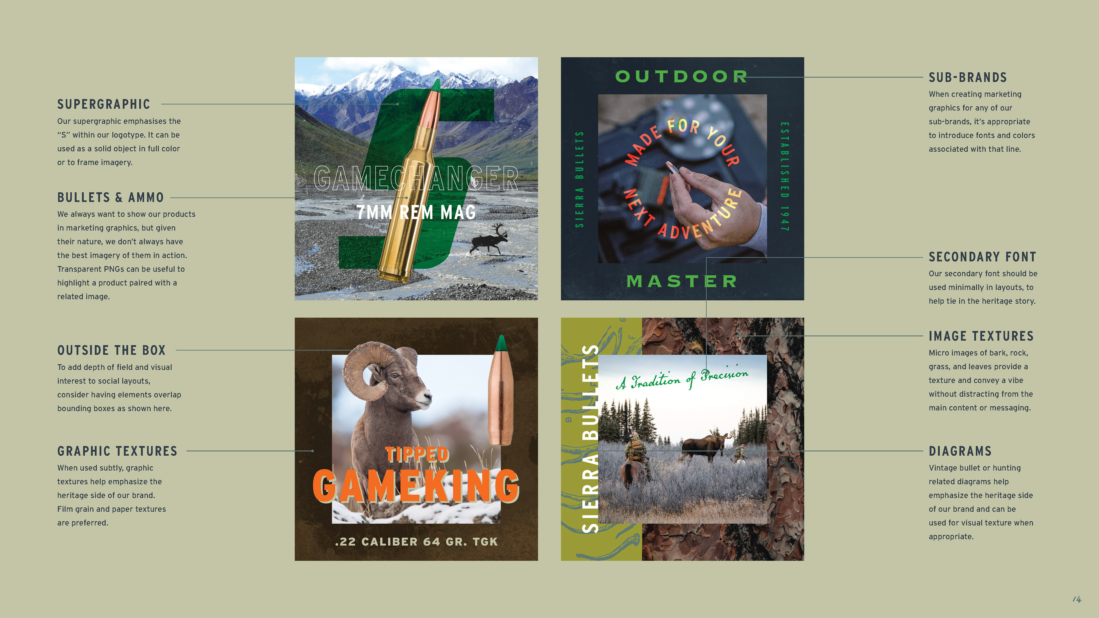
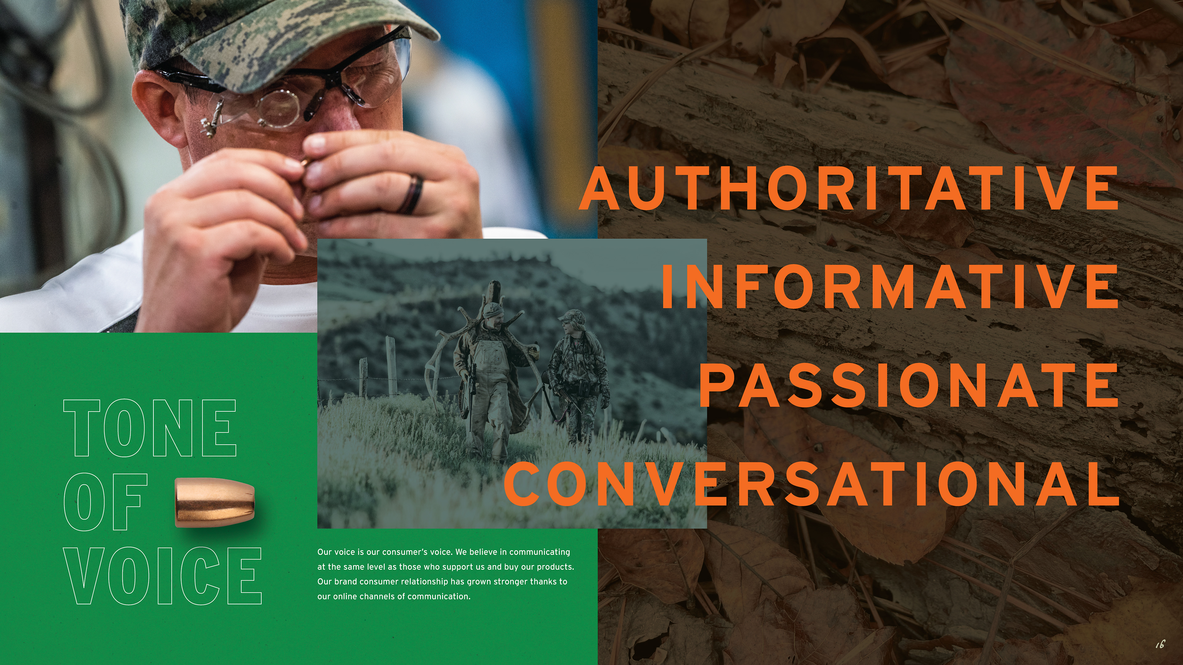
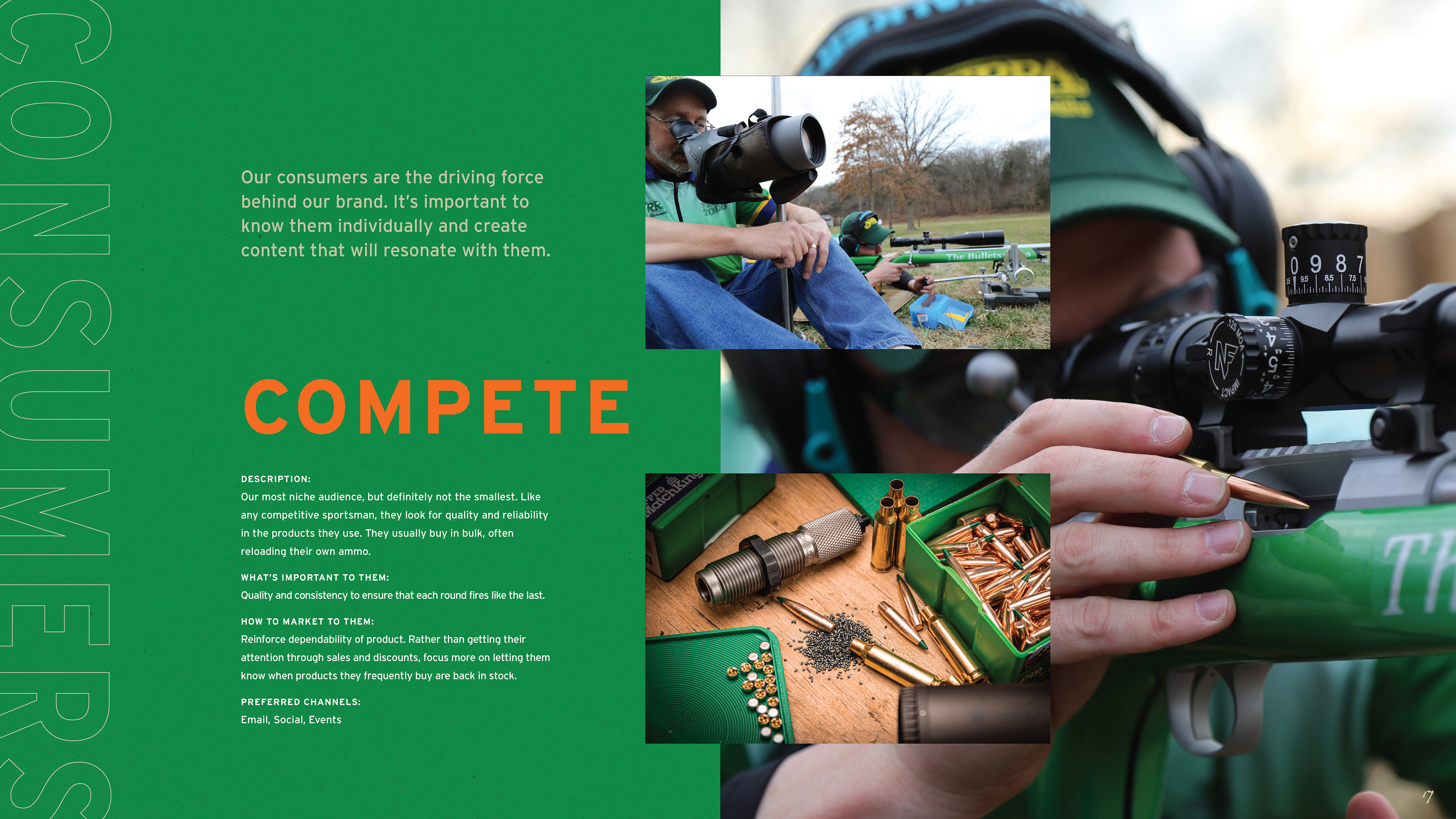
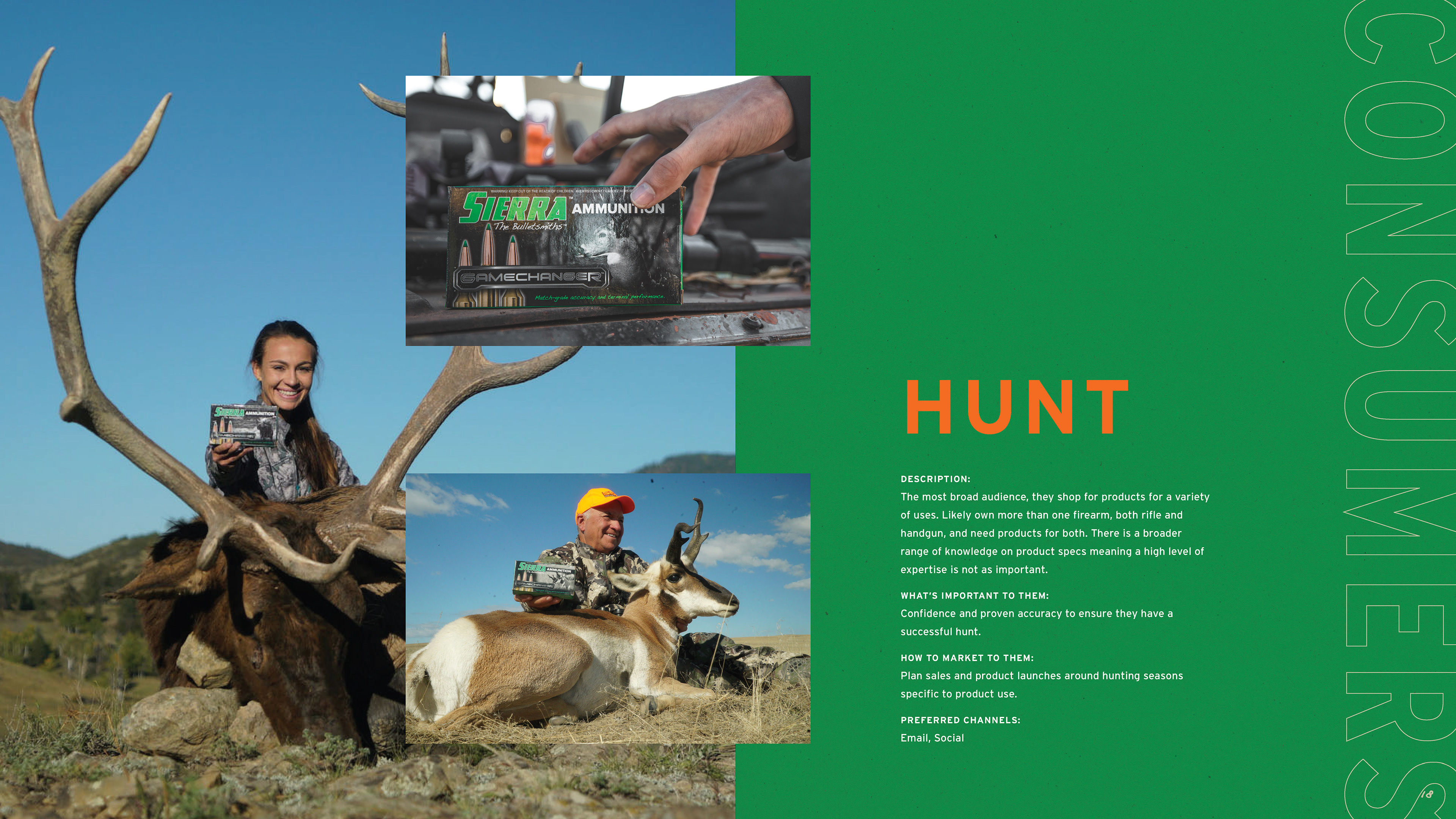
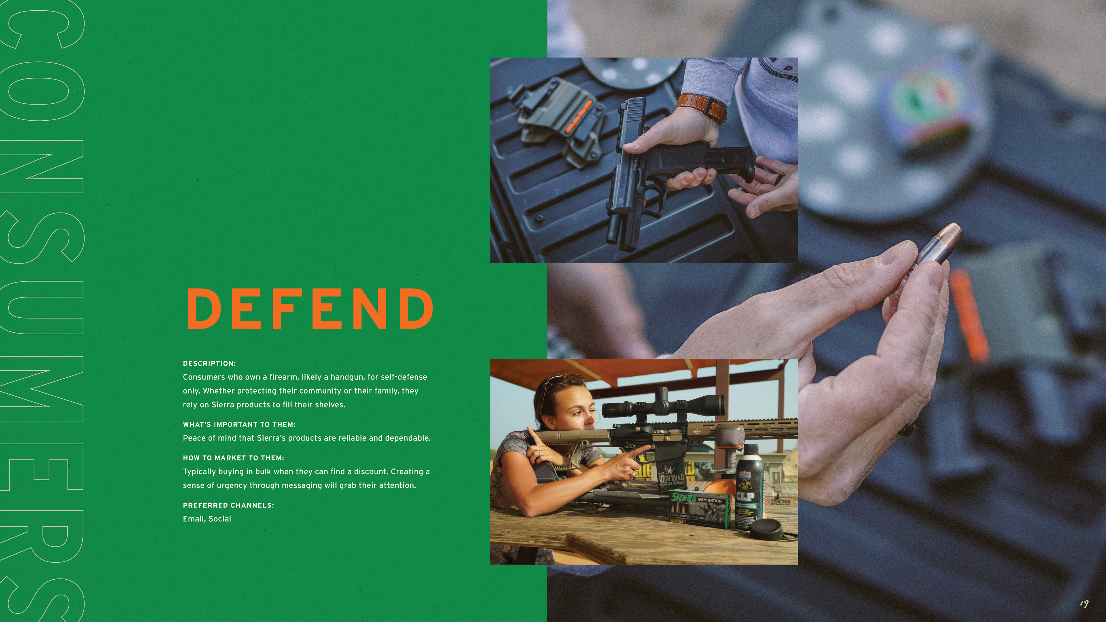
The work began in 2019 with packaging and website updates, project by project, product line by product line. As the work demonstrated what the brand was capable of, the scope expanded. What started as individual packaging assignments eventually led to a full brand guidelines document — one that codified the complete visual language of Sierra: logo standards, a color palette drawn from the natural landscape the brand's consumers inhabit, a typography system built for both heritage and performance contexts, and three distinct imagery categories — lifestyle, landscapes, and animals — each with detailed direction for how to shoot and select photography. Beyond visuals, the guide defined Sierra's tone of voice and mapped three core consumer personas: Compete, Hunt, and Defend, each with distinct needs, motivations, and preferred channels.
The result was a document that gave Sierra's internal team and external partners a shared language for the brand — one grounded in 70-plus years of precision manufacturing and built to scale.
AGENCY: Voltage AD
ROLE: Art Direction, Brand System Design