Sundance Bay is a real estate investment firm operating in a competitive market where credibility and trust are everything. The brand existed but lacked the visual system and strategic clarity needed to signal the level of professionalism their target investors expected.
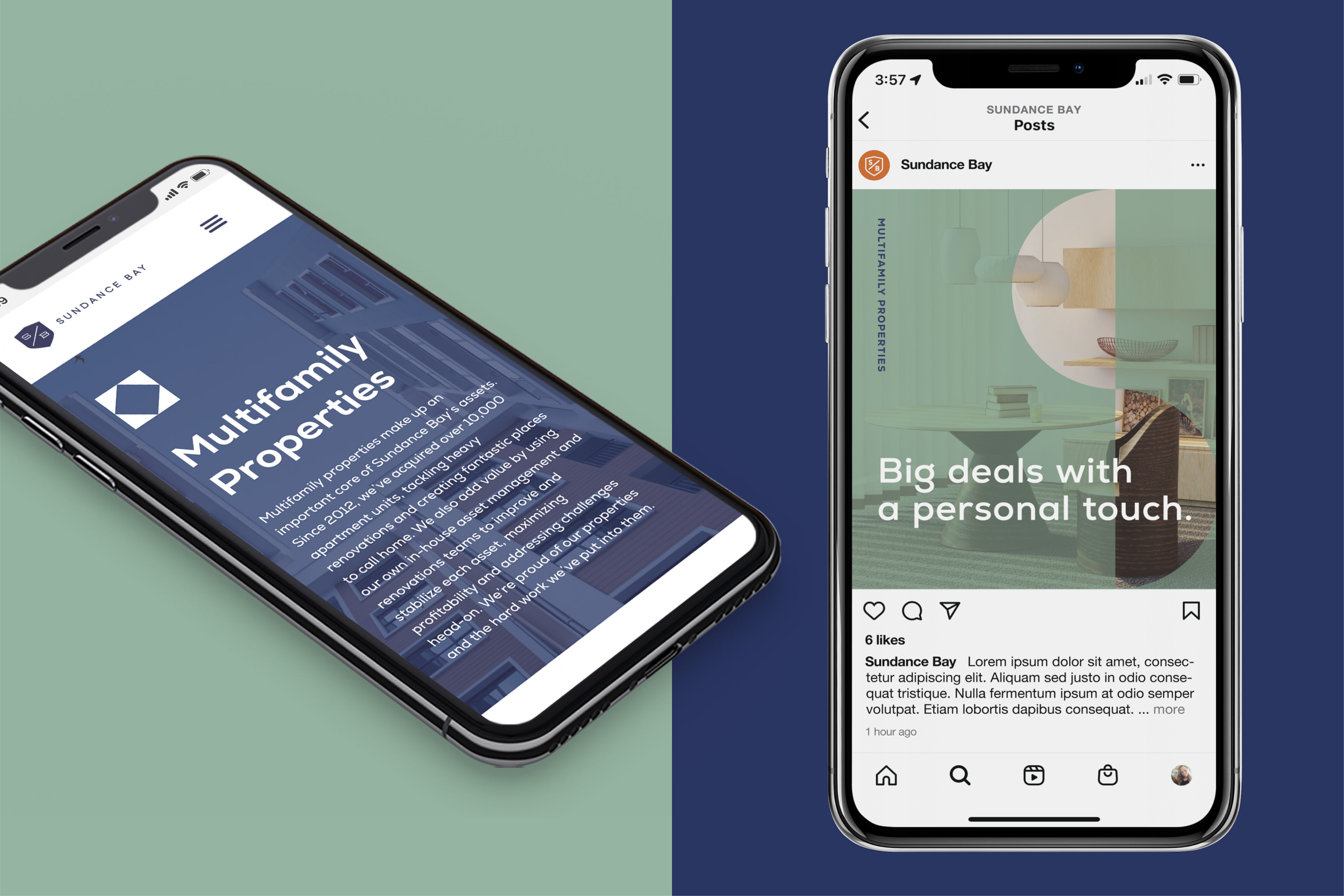
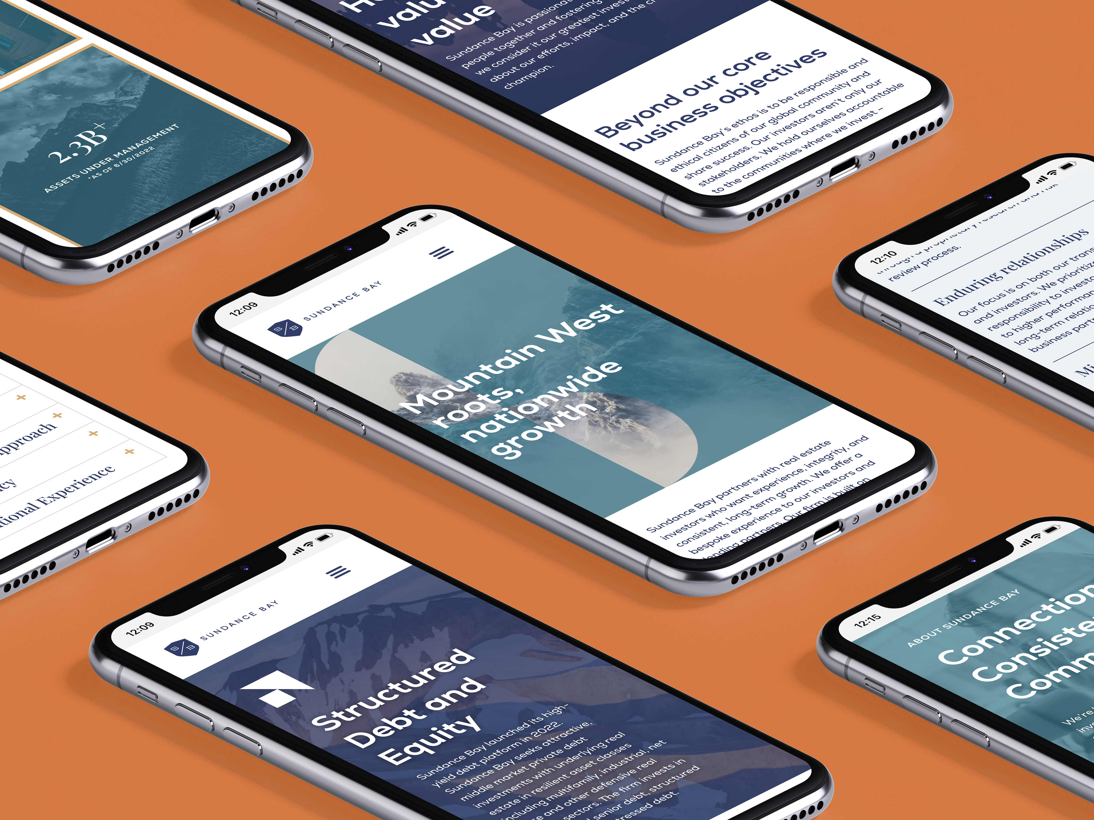
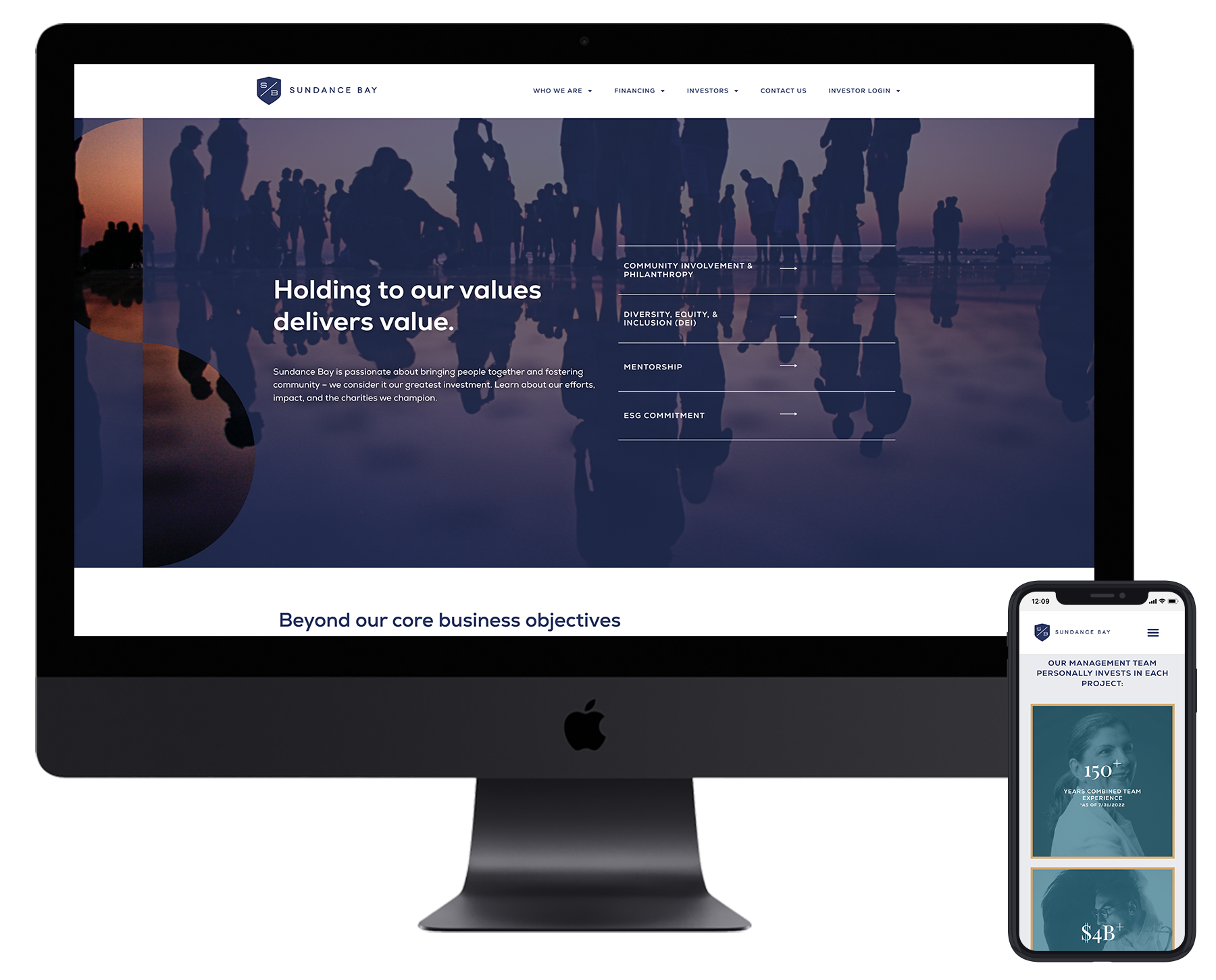
The rebrand began with logo refinement — cleaning up the existing mark and giving it the precision it needed to anchor a more sophisticated identity. From there, the creative direction drew from nautical wayfinding as a visual language: a nod to navigation, direction, and confident expertise that felt native to the investment world without being literal. Color, typography, and graphic elements were developed from that foundation, along with a supergraphic system designed to add dimension and frame content across applications where the logo alone couldn't carry the visual weight.
I led art direction and interaction design across the full engagement — brand guidelines, photography direction, a UI style guide, branded PowerPoint and Word templates for day-to-day communications, and a custom WordPress website designed page-by-page for responsive use. Every touchpoint was built to reinforce the same message: this is a firm that knows where it's going.
AGENCY: Voltage AD
ROLE: Art Direction, Interaction Design